


Welcome to The Market’s Compass US Index and Sector ETF Study, Week #601. As always it highlights the technical changes of the 30 US Index and Sector ETFs that I track on a weekly basis and normally publish every third week. Past publications can be accessed by paid subscribers via The Market’s Compass Substack Blog.


To understand the methodology used in constructing the objective U.S. Index and Sector ETF Individual Technical Rankings visit the MC’s Technical Indicators page at www.themarketscompass.com and go to “us etfs”. What follows is a Cliff Notes version* of the full explanation…
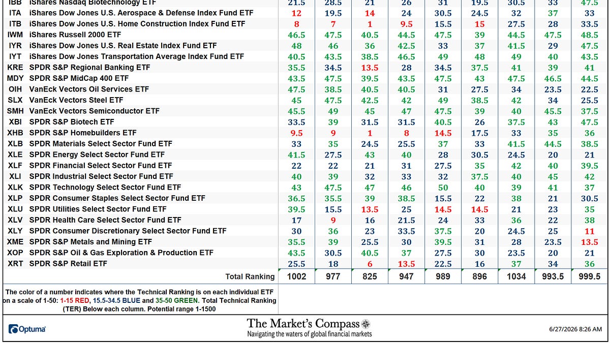
*The technical ranking system is a quantitative approach that utilizes multiple technical considerations that include but are not limited to trend, momentum, measurements of accumulation/distribution and relative strength of each individual 30 U.S Index and Sector ETFs that can range between 0 and 50. The Total Technical Ranking is the sum of the 30 US ETFs individual Technical Rankings.
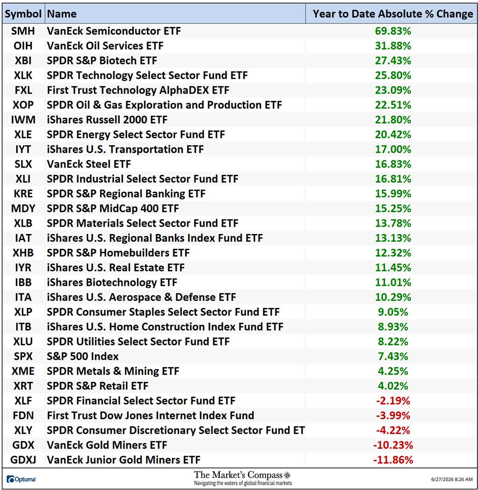
The Total Technical Ranking or “TER” of the U.S. Index and Sector ETFs rose +0.60% last week to 999.5 from 993.5 two weeks ago which was a drop from 1034 three weeks ago which was the best level since seven weeks before (1036 on 4/24).
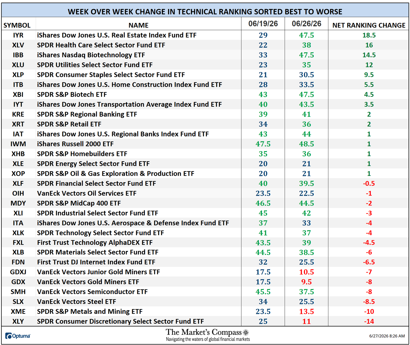
Fifteen ETFs registered increases in their TRs last week and fifteen ETF TRs fell. Of the fifteen that had TRs that were higher, four rose by double-digits. Eighteen ETF TRs ended the week in the “green zone” (TRs from 35 to 50), eight ended the week in the “blue zone” (TRs from 15.5 to 34.5), and four were in the “red zone” (TRs between 0 and 15). The previous week there were fourteen TRs in the “green zone” and sixteen were in the “blue zone”. The average TR loss on the week was -0.43, vs. the week before average TR loss of 1.45. The week before that, the average TR gain was +4.88 with twenty-three TRs gaining ground with seven TRs falling.
The Relative Rotation Graph, commonly referred to as RRGs were developed in 2004-2005 by Julius de Kempenaer. These charts are a unique visualization tool for relative strength analysis. Chartists can use RRGs to analyze the relative strength trends of several securities against a common benchmark, (in this case the SPX Index) and against each other over any given time period (in the case below, daily) over the past three weeks. The power of RRG is its ability to plot relative performance on one graph and show true rotation. All RRGs charts use four quadrants to define the four phases of a relative trend. The Optuma RRG charts uses, From Leading (in green) to Weakening (in yellow) to Lagging (in pink) to Improving (in blue) and back to Leading (in green). True rotations can be seen as securities move from one quadrant to the other over time. This is only a brief explanation of how to interpret RRG charts. To learn more, see the post scripts and links at the end of this Blog.
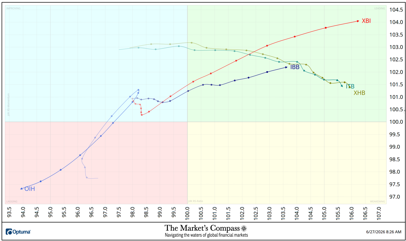
After a brief stutter step in the Improving Quadrant three weeks ago the SPDR S&P Biotech ETF (XBI) “took off on a tear” into the Leading Quadrant displaying extraordinary Relative Strength Momentum (note the distance between the daily nodes) and at the close of last week it sported the the highest Relative Ratio (106.25) of the thirty US Index and Sector ETFs I track in these pages. I brought attention to both the iShares Dow Jones U.S. Home Construction ETF (ITB) and the SPDR S&P Homebuilders ETF (XHB) last week when they exited the Lagging Quadrant and rose into the Improving Quadrant to a level that has been referred to “the sweet spot” worthy of technical attention. Although they have lost a measure of Relative Strength Momentum they both have continued to improve on a Relative Strength basis. On the coattails of the XBI the iShares Nasdaq Biotechnology ETF also escaped the Improving Quadrant and is rising in the Leading Quadrant. Both the SPDR S&P Oil and Gas Exploration & Production ETF (XOP) and the VanEck Vector Oil Services ETF (OIH) did an abrupt U-turn after climbing into the Improving Quadrant and fell sharply back into the Lagging Quadrant.
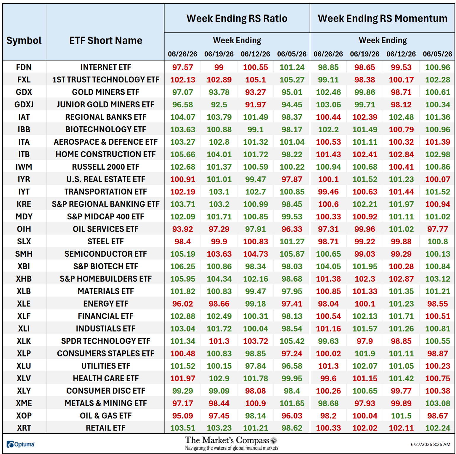
The Relative Strength and Relative Strength “Tabulation Table” begins with the readings at the end of last week followed by the trailing three weeks that includes the Readings from the last Study. If there has been an improvement in either the Relative Strength Ratio or the Relative Strength Momentum reading on a week-over-week basis I have highlighted it in green. If there has been a contraction in either, it is highlighted in red and an unchanged reading in either will remain in black. Both the Relative Strength Ratio and Relative Strength Momentum number are, although not shown on the table, are percent valuations vs. the benchmark at weeks end. The color-coding system serves as a heat map over the past four Friday’s readings highlighting either the continued improvement, deterioration, or stasis vs. the benchmark, the SPX Index.
*The Technical Condition Factors are derived from a calculation of the total Individual US Index and Sector ETF Technical Rankings. What is shown in the excel panel below is the total TCFs of all thirty TRs. A few TCFs carry more weight than the others, such as the Weekly Trend Factor and the Weekly Momentum Factor in compiling each individual TR of each of the 30 ETFs. Because of that, the excel sheet below calculates each factor’s weekly reading as a percentage of the possible total.
To fully understand the construction the of The Technical Condition Factors visit the MC’s Technical Indicators page at www.themarketscompass.com and go to “us etfs”.
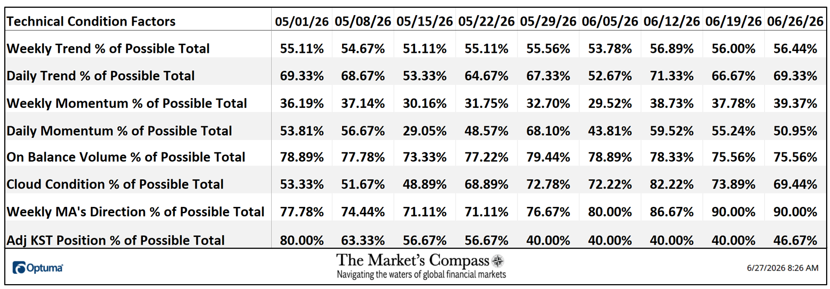
One technical takeaway would be, for example, if the Daily Momentum Condition Technical Factor or DMCTF rose to an extreme between 85% and 100%, it would suggest a short-term overbought condition. Conversely, a reading in the range of 0% to 15% would suggest an oversold condition was developing. Last week in drop for the third week in a row a reading of 50.95% or 207 out of a possible 210 total positive points was registered.
As a confirmation tool, if all eight TCFs improve on a week over week basis, more of the 30 ETFs are improving internally on a technical basis confirming a broader market move higher (think of an advance/decline calculation). Conversely if all eight TCFs fell over the week it confirms a move lower in the broader market. Last week four TCFs rose, two fell and two were unchanged.
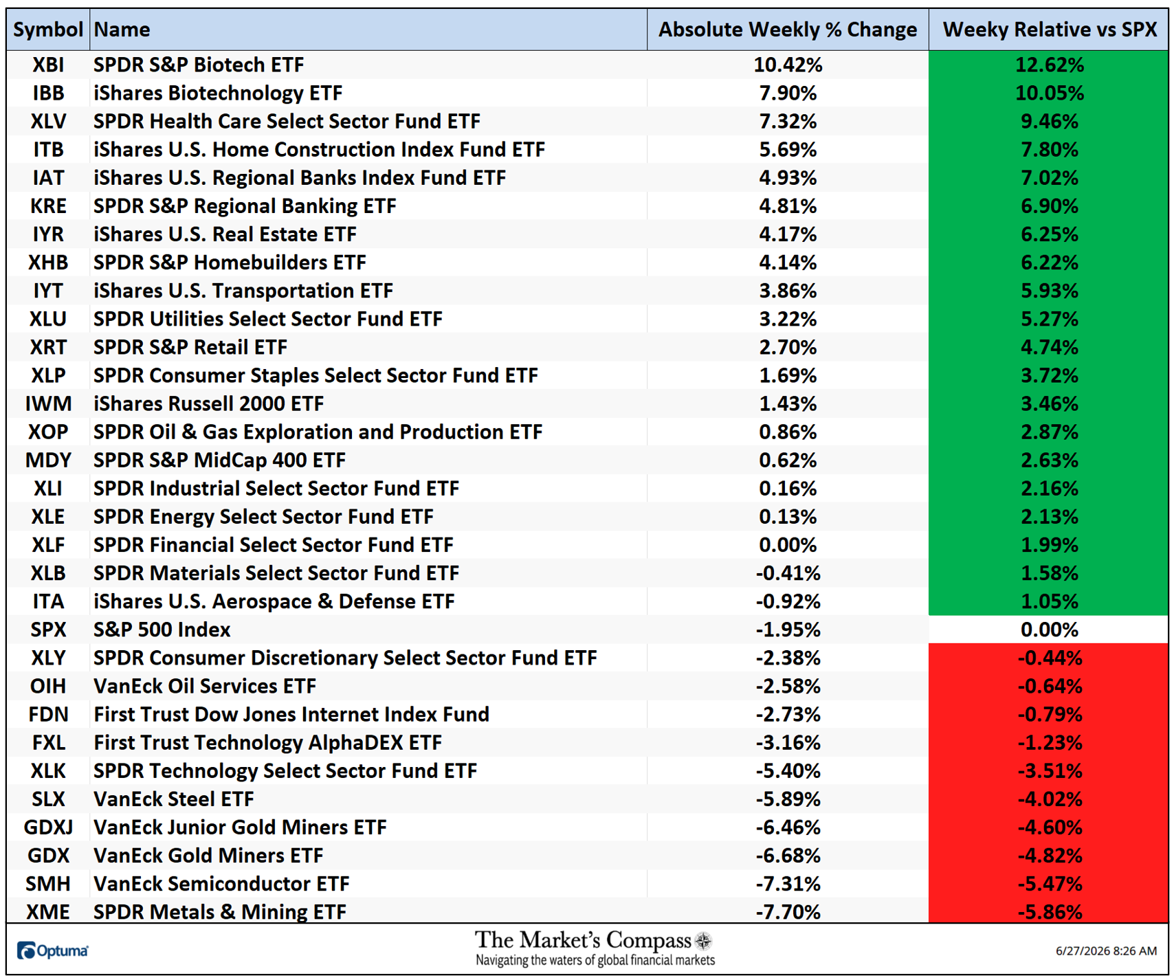
Last week seventeen of the US Index and Sector Study ETFs were up on an absolute basis, one was unchanged, and twelve lost ground on an absolute price basis. Twenty ETFs outpaced the S&P Index -1.95% loss in the large cap index and ten underperformed on a relative basis. The 5-Day Average Absolute Price Change was +0.41% vs. the week before Average Absolute Price loss -0.39% and +2.58% Average gain three weeks ago.
The Weekly Average Technical Ranking (“ATR”) is the average Technical Ranking of the 30 US Index and Sector ETFs we track. It is a confirmation/divergence as well as an overbought/oversold indicator.
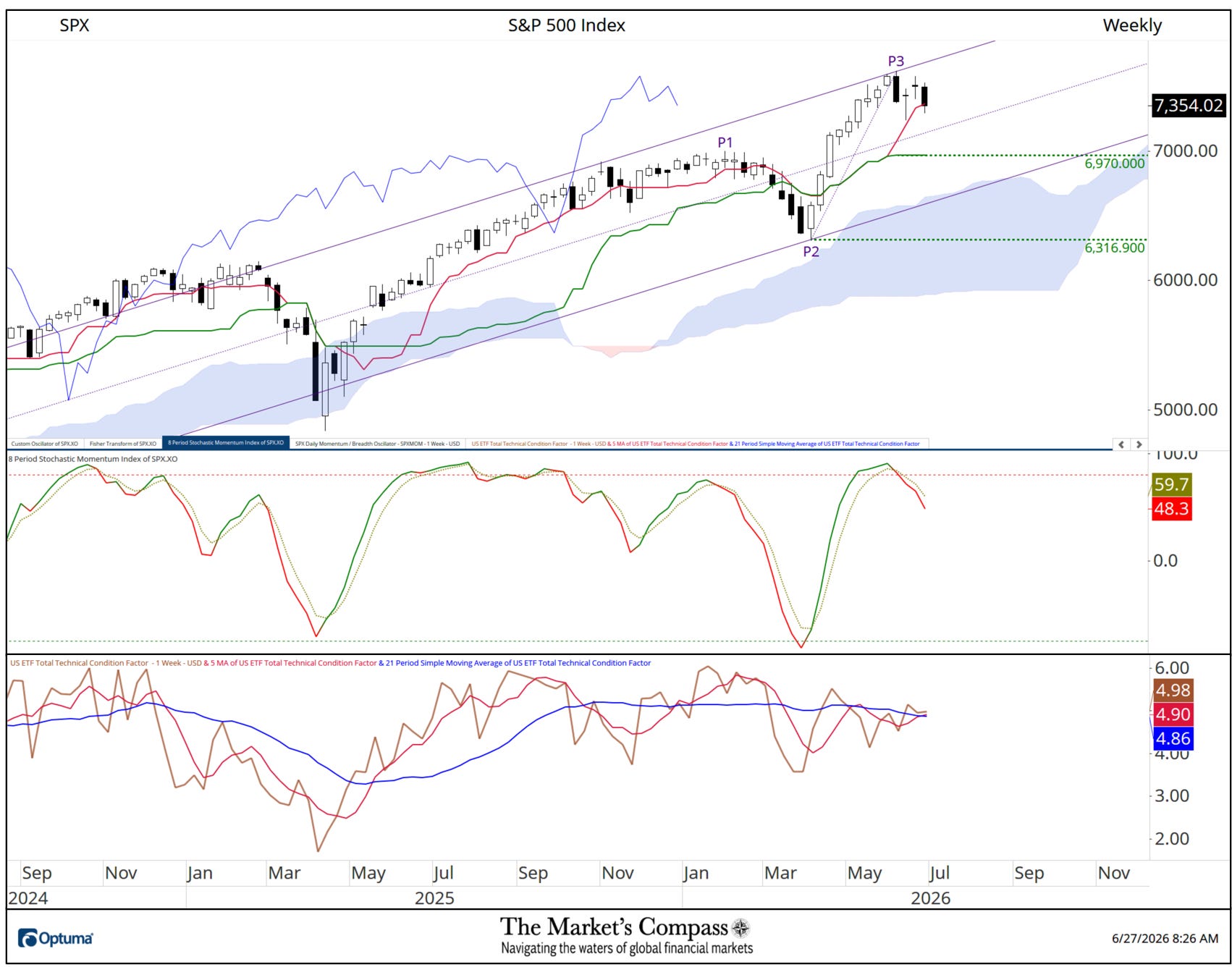
When the S&P 500 Index reversed and sold off for the week ending June 5th and closed at just above the lows for the week I drew a new Schiff Pitchfork. Two Weekly long legged Doji followed and last week the large cap Index resumed its downdraft, closing Friday on the Tenkan Plot (red line). The Stochastic Momentum Index has retreated from overbought territory and is tracking lower below it signal line. The US Average Technical Ranking or “ATR” failed to confirm the P3 price pivot high and both moving averages of the ATR are tracking sideway on top of each other. The Daily chart and technical comments further clarifies my technical concerns.
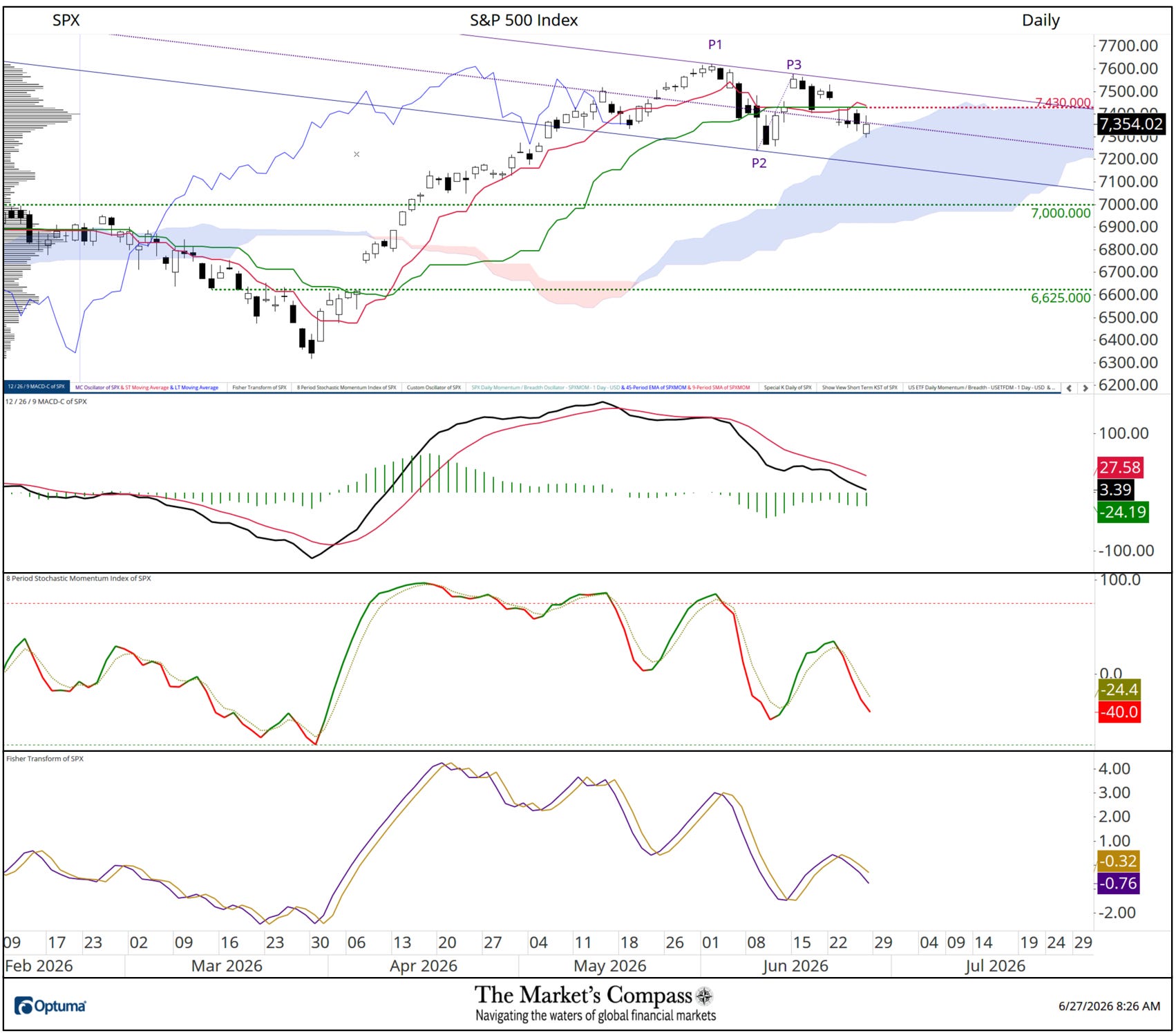
At the start of the holiday shortened week which was a week ago last Monday, the SPX Index notched a lower high and on the following Wednesday when the large cap index fell and closed below the Kijun Plot (green line) I drew a new Schiff Modified Pitchfork (violet P1-P3) to delineate the new short-term corrective price action. On Tuesday of last week price broke below the Kijun Plot and this time, and over the balance of the week it has definitively capped attempted price advances since, as well as a close back above the Median line (violet dotted line) of the Pitchfork. That said the Cloud Model did offer a measure of support on a closing basis Friday. Both longer-term MACD and shorter-term Stochastic Momentum Index momentum oscillators do not suggest a meaningful turn it downside price momentum. This is in concert with the Fisher Transform rolling over below its signal line. All off the above technical comments lead to this week’s subtitle “The Dust Hasn’t Settled Yet”.
For readers who are unfamiliar with the technical terms or tools (including the Fisher Transform) referred to in the comments on the technical condition of the SPX can avail themselves of a brief tutorial titled, Tools of Technical Analysis and an in-depth comprehensive lesson on Pitchforks is available on my website…
Charts are courtesy of Optuma whose charting software allows the Technical Rankings to be calculated and back tested.
To receive a 30-day trial of Optuma charting software go to…